I have researched transitions that I then incorporated into my trailer whilst editing.
I like the shot reverse shot used (0.27-0.30) as you are getting information from one person, then when it jumps to the next person it reinforces the subject of the conversations, the myth of the blair witch. It also shows reaction shots that reflect what the first woman was talking about.
I think the cut to black (0.51), enhanced with the non-diegetic atmospheric sound, creates an eerie feeling, and creates tension amongst the intended audience. It is also used again (1.01) to create the same tension, after the woman states 'I know we're not lost.' The black shows that what happens could be contradictory to what the character thinks.
In summary, there isn't really a diverse range of transitions in this trailer, just a lot of straight cuts and cuts to black, yet I think this emphasises the sort of movie it is, as hand-held cameras are used, there wouldn't be many elaborate transitions, this is what I wanted to achieve with my trailer.
Sunday, 10 April 2011

Friday, 1 April 2011
Research and Planning: Poster Update
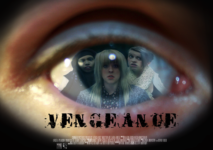
I have almost finished the poster. I now need to gather some audience feedback in order for me to improve the design and layout. I also need to make sure that the credits at the bottom are in the correct order of a typical conventional film poster.
I will gain feedback by posting an image on facebook and asking people to comment on it.
Research and planning: Film Logos
We all brainstormed as a group and came up with the name 'crooked pictures' for a film production title. Anika then went to create it in Photoshop:

I then went on to create another film production logo, as one isn't enough to put on the film poster, I came up with the name 'granite films' and then created a simple logo in Photoshop:


I then went on to create another film production logo, as one isn't enough to put on the film poster, I came up with the name 'granite films' and then created a simple logo in Photoshop:

Friday, 25 March 2011
Research and Planning: Magazine Update
 Today I worked on putting font and arranging my magazine cover. I added a barcode, and price (which needs to be moved)
Wednesday, 16 March 2011
Research and Planning: Magazine Photographs
Magazine Photographs:
Today I took some photographs of Brendon and myself for my magazine cover. I then proceeded to edit the photographs using Photoshop and realised after looking at examples of magazines that I would quite like to have a background instead of a block colour. I then went and took more photographs of isolated and spooky looking areas as the backgrounds to the photographs weren't what I was looking for. The following are examples of the sorts of photographs I took:

 (Brendon Took this one! ^)


Today I took some photographs of Brendon and myself for my magazine cover. I then proceeded to edit the photographs using Photoshop and realised after looking at examples of magazines that I would quite like to have a background instead of a block colour. I then went and took more photographs of isolated and spooky looking areas as the backgrounds to the photographs weren't what I was looking for. The following are examples of the sorts of photographs I took:

 (Brendon Took this one! ^)


Friday, 4 March 2011
Research and Planning: Poster
 Today I could begin working properly on my poster, as the group managed to get together to take the photographs I need for my poster and magazine ideas.
In order to achieve what I have created here, I imported the photograph of me, Becky and Anika onto the photograph of the eye, and changed the opacity so that you can see the eye through us. I then used the warp tool to fit the photograph of us into the shape of the eye, and used the eraser tool to neaten up the edges. I quite like the way it looks now, but I don't think it looks professional enough, I obviously need to add the title and release date, but I think I'm going to use the gradient tool to fade out the edges of the eye. I will need feedback on what I have created so far, so perhaps I will upload what I have onto Facebook to allow for many people to give constructive criticism...hopefully.
Subscribe to:
Posts (Atom)