Tuesday, 12 April 2011
Evaluation: Q4 - How do you use media technologies in the construction and research, planning and evaluation stages?
* All photographs used are example images used to demonstrate techniques, not the original photographs used for my magazine and poster.
* Video footage used is also example footage, not the original.
Evaluation: Q1 - In what way does your media product use, develop and challenge forms and conventions of real media products?
 Magazine
- The size of the masthead along with the positioning and font design is very conventional. I copied Total Film in the use of the 'up' being inside 'close.'
- I have all the conventional aspects that are typical to magazines such as the bar-code and price, both positioned where you would expect to find them.
- The main feature, or main photograph, is centered and large, which is typical of any magazine, I think I challenged the conventions by making the background photograph black and white, and keeping the character in colour, which allows it to stand out more.
- All of the fonts I have used are quite conventional, as they are all basic fonts that are easy to read, especially the masthead. The only thing that I perhaps developed is the font being longer than that of Total Film.
- The majority of the layout is very conventional, as I have tried to make the page as symmetrical as possible to make it look neat, whilst using an issue of Total Film (pictured right) for my
 muse. The tag-line, film title and majority of features are positioned in the same, or similar, places. The also used the same colour scheme, red, white, black and metallic.
- I used the circle that was used in Total Film in my magazine. They are ultimately the same, yet mine slightly differs in the use of fonts. This is the same for the Movie Title, 'Vengeance,' as I copied the metallic-like font to match the circle, as the circle on it's own looked out of place being the only item on the cover of that specific colour.
- I developed design ideas by taking the idea of border lines from Total Film and expanding them on my own magazine, to fill up more space without it being overcrowded.
- I aligned my magazine in order to keep all the contents within the recommended distance from the edge of the page, this is something I perhaps developed, as the distance is quite large in comparison to Total Film.
Teaser Trailer
- Our trailer is conventional in that it serves the typical purpose of a teaser trailer, which is to 'tease' the audience by showing a minimal amount of footage from the film, whilst still enthralling the target audience.
- It is only 1:14, which is typical of a teaser trailer.
- It contains the green preview screen at the very beginning, which is conventional, as every teaser trailer is required to have this to show that it has been approved for the intended audience.
- The trailer also contains both of our company logos which we designed, also conventional.
- It is conventional in the use of music to reflect the characters mood, or a change in the plot. For example, in our teaser (0.35) the dramatic music shows the character breaking, obviously this is aided with the context beforehand.
- The trailer contains screens with writing, which is typical for a teaser trailer.
- It introduces the characters right away, which most teasers do as there is limited time.
- Whilst editing the teaser trailer I challenged conventions by the use of inverted colour (0.34) as I hadn't seen this on any trailers I had looked at for research beforehand. I did it to reflect the characters emotions at that point.
- We also developed ideas by having a black screen with the audio dubbed over. I hadn't seen this directly in any other trailer, but have seen similar things in the past, and thought it would be effective to use this in our trailer.
- The use of Kuleshov Effect is very conventional for a horror film trailer.
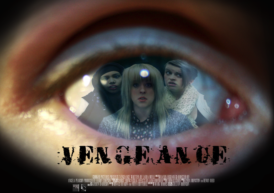
Film Poster

- The black fade on the outside is a development considering the genre, and my own ideas for the poster. Dark colours and black are usually associated with horrors/thrillers as the connotations of these colours reflect the genres content.
- The use of an eye in itself is conventional, as eyes are windows to emotions and used alot in the media to reflect a chosen emotion such as terror or hate, an example of this would be in the 'mirrors' poster (pictured right) besides the colour scheme and the heavy black bordering, you can still tell that it is a horror from the use of the eyes.

- I think I challenged conventions by having all the main characters pictured (including Brendon's eye.) In real media posters, there is usually only the protagonist pictured, and lesser characters are shoved to the side. I feel all the girls from Vengeance play an important role in adding mystery, fear and suspense. Also, by having all girls pictured, it appeals to a wider audience.
- The list of staff at the bottom is strictly conventional, as I researched into the order of the producer, director etc and made sure they were in a chronological order as to make the poster more realistic.
- The use of film logos and websites are also conventional, as the majority of posters have this.
- The colour of the eye is perhaps something I developed, as initially I wanted more red to try and reflect the 'danger' connotation, but found that hints of blue worked more effectively to provide the element of 'creepiness' that was essential for the poster to fulfill its purpose.
- The font used for the title is conventional. Initially I wanted a more animated font, to reflect the horror genre...but it was perhaps slightly misleading, and didn't really reflect the content of the trailer very well. I decided to go for a sharp, hard font, which portrays 'Vengeance' greater than the messy font I had. The 'Mirrors' poster uses a similar font, possibly, like myself, to reflect the context of the title.
Monday, 11 April 2011

Research and Planning: Poster
 This is the final result of my Movie Poster. The detail seems to have eroded somewhat due to the JPEG transformation, the white is brighter and the overall image is sharper.
Research and Planning: Final Teaser Trailer
This is the final teaser trailer. We decided to shorted certain scenes as the time was running out.
Sunday, 10 April 2011
Research and Planning: Transition Research
I have researched transitions that I then incorporated into my trailer whilst editing.
I like the shot reverse shot used (0.27-0.30) as you are getting information from one person, then when it jumps to the next person it reinforces the subject of the conversations, the myth of the blair witch. It also shows reaction shots that reflect what the first woman was talking about.
I think the cut to black (0.51), enhanced with the non-diegetic atmospheric sound, creates an eerie feeling, and creates tension amongst the intended audience. It is also used again (1.01) to create the same tension, after the woman states 'I know we're not lost.' The black shows that what happens could be contradictory to what the character thinks.
In summary, there isn't really a diverse range of transitions in this trailer, just a lot of straight cuts and cuts to black, yet I think this emphasises the sort of movie it is, as hand-held cameras are used, there wouldn't be many elaborate transitions, this is what I wanted to achieve with my trailer.
Friday, 1 April 2011
Research and Planning: Poster Update
I have almost finished the poster. I now need to gather some audience feedback in order for me to improve the design and layout. I also need to make sure that the credits at the bottom are in the correct order of a typical conventional film poster.
I will gain feedback by posting an image on facebook and asking people to comment on it.
Research and planning: Film Logos
We all brainstormed as a group and came up with the name 'crooked pictures' for a film production title. Anika then went to create it in Photoshop:

I then went on to create another film production logo, as one isn't enough to put on the film poster, I came up with the name 'granite films' and then created a simple logo in Photoshop:


I then went on to create another film production logo, as one isn't enough to put on the film poster, I came up with the name 'granite films' and then created a simple logo in Photoshop:

Friday, 25 March 2011
Research and Planning: Magazine Update
 Today I worked on putting font and arranging my magazine cover. I added a barcode, and price (which needs to be moved)
Wednesday, 16 March 2011
Research and Planning: Magazine Photographs
Magazine Photographs:
Today I took some photographs of Brendon and myself for my magazine cover. I then proceeded to edit the photographs using Photoshop and realised after looking at examples of magazines that I would quite like to have a background instead of a block colour. I then went and took more photographs of isolated and spooky looking areas as the backgrounds to the photographs weren't what I was looking for. The following are examples of the sorts of photographs I took:

 (Brendon Took this one! ^)


Friday, 4 March 2011
Research and Planning: Poster
 Today I could begin working properly on my poster, as the group managed to get together to take the photographs I need for my poster and magazine ideas.
In order to achieve what I have created here, I imported the photograph of me, Becky and Anika onto the photograph of the eye, and changed the opacity so that you can see the eye through us. I then used the warp tool to fit the photograph of us into the shape of the eye, and used the eraser tool to neaten up the edges. I quite like the way it looks now, but I don't think it looks professional enough, I obviously need to add the title and release date, but I think I'm going to use the gradient tool to fade out the edges of the eye. I will need feedback on what I have created so far, so perhaps I will upload what I have onto Facebook to allow for many people to give constructive criticism...hopefully.
Tuesday, 15 February 2011
Research and Planning: Font Choices
Here are some examples of fonts I would consider using for my poster cover. At the moment I seem to be favouring the first and fourth ones in the list. I think the least likely option would be the last in the list.


Wednesday, 9 February 2011
Research and Planning: Planning Poster
Today I have been playing around with Photoshop with, in my opinion, the best photograph of Brendons' eye for my poster.
 I have played around with the colour variations, adding more blues and greens to tone down the overall appearance, as if the eye is too colourful, it will drown out the photographs of me, Anika and Becky in the middle.
I have also messed with the 'skew,' 'perspective' and 'scale' tools to try and make the eye more bulbous. This worked slightly, but there is no major noticeable changes in the appearance of the eye. I researched into making 2D objects more 3D online, but unfortunately the majority of descriptions are for the extended version of Photoshop, which is unavailable to me.
As you can see towards the bottom of the eye, I tried different tools such as the 'eraser' tool and 'paint' tool, varying the opacity with both, but it wasn't completely successful.
I also tried the gradient line tool to try and fade the eye into the background, but it just made the entire image black.
I will have to keep playing around with edit tools and filters in order to achieve the effects that I'm aiming for.
Also, I can't add the photographs of the characters to import into the eye as they have not been taken yet, unfortunately, as Becky is in and out of hospital and I need a photograph of all of us togther, it is proving difficult to arrange a time to take these photographs.
Wednesday, 2 February 2011
Group Meeting
The group and I have decided once again to change the name of the movie from Avenge to Vengeance, as the definition of vengeance coincides more with the narrative.
ven·geance (v n
n j
j ns)
ns)
We need to take new photographs for the new poster and magazine ideas, which we have planned for 3rd Feb, and film some more shots of conventional horror scenes such as characters screaming, and shadows etc, so I can them edit them into a flash of images so that it looks more like a horror trailer. We should be filming on the 3rd and the 9th Feb.
ven·geance (v
njns)n.
Idiom: Infliction of punishment in return for a wrong committed; retribution.
with a vengeance
1. With great violence or force.
2. To an extreme degree: December has turned cold with a vengeance.
We need to take new photographs for the new poster and magazine ideas, which we have planned for 3rd Feb, and film some more shots of conventional horror scenes such as characters screaming, and shadows etc, so I can them edit them into a flash of images so that it looks more like a horror trailer. We should be filming on the 3rd and the 9th Feb.
Research and Planning: Poster Ideas
For my poster, I have decided to have a photograph of Brendons' (the murderers) eye, with the myself, Becky and Anika reflected in it. I chose this idea as the composition of the design would interest the reader more than say just a photograph of one of the characters. The eye design also tells more of the narrative, as the murderer watches the girls before killing them one by one.
Draft of Idea:
 I'm unsure as to what shot types to have of the three girl characters, whether to have medium close ups, or medium long shots. I think the issue with the medium long shots would be the difficulty in the distinction of the characters, as there may be too many different colours and textures that would make it hard to concentrate. The issue with the medium close up would be that, in oppose to too many variations of colour, there would be a very small range of colours and therefore the photographs of the girls could merge together and be had to distinguish.
I have taken some photographs today of Brendon and his eye. The following three photographs are examples of good shots, and the three after are examples of bad shots:


Wednesday, 19 January 2011
Research and Planning: Camera Knowledge

For an image to look professional it needs to be very clear, sharp and needs to have some kind of interest for the target audience.
We took some photographs using both the SLR and digital cameras, and the results were that SLR cameras are alot more focused, contrasted more and were sharper than the digital photographs.

Tuesday, 11 January 2011
Research and Planning: Rough Trailer
Today I completed the preliminary teaser trailer, a rough version of what I hope to be the final result. I decided not to input the garage band samples into this version, as there were plenty of sample sound effects on iMovie. These sounds, however, sometimes don't quite match the emotion of the scene. So for the final result, I intend to play around with garage band to try and find sound that will match the clips...I will have to discuss this with Becky and Anika, as sound is a shared micro-element and must have all our input.
I will show the edited trailer to Becky and Anika tomorrow and take on board their feedback in order to result with an improvement.
I will show the edited trailer to Becky and Anika tomorrow and take on board their feedback in order to result with an improvement.
Friday, 7 January 2011
Research and Planning: Starting on Sound
 Today I started to play around with sounds for the teaser trailer using Garage band, as when continuing with editing in iMovie, I found a couple of ambient sounds which I incorporated at the beginning of the trailer, but no music that greatly reflected the mood of the film, I hopefully hope to create a sort of soundtrack that can be associated with the trailer.
Wednesday, 5 January 2011
Research and Planning - Starting to Edit
 Today I imported the video we made on the camcorder into iMovie so I can then begin to really get stuck into editing. I'm going to have an initial play around with the program first to familiarise myself with all the different effects and techniques I can use in order to use the programs full potential on the teaser trailer, as what I have created (picture left) is not necessarily what will be included in the end result.
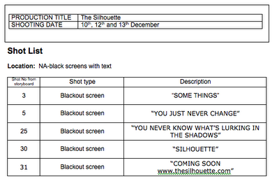
 I need to research into how to putting blank screens for the clips with words on the screens, e.g. "there are some things you just never forget.' I aim to do this for the next lesson I have.
Research and Planning: Group Meeting
Members Present: 3
Today Anika, Becky and myself decided to change the name of the film to 'Avenge' rather than 'The Silhouette' as further research into the correct definition of each word shows that Avenge fits the storyline of the film more.
a·venge (-vnj)
sil·hou·ette (s l
l
 -t)
-t)
Today Anika, Becky and myself decided to change the name of the film to 'Avenge' rather than 'The Silhouette' as further research into the correct definition of each word shows that Avenge fits the storyline of the film more.
a·venge (
-vnj)tr.v. a·venged, a·veng·ing, a·veng·es
1. To inflict a punishment or penalty in return for; revenge: avenge a murder.
2. To take vengeance on behalf of: avenged their wronged parents.
[Middle English avengen, from Old French avengier : a-, to (from Latin ad-; see ad-) + vengier, to vindicate (from Latin vindic re, to claim; see vindicate).]
re, to claim; see vindicate).]a·venger n.
er n.a·venging·ly adv.
ing·ly adv.sil·hou·ette (s
l-t)n.
tr.v. sil·hou·et·ted, sil·hou·et·ting, sil·hou·ettes To cause to be seen as a silhouette; outline:1. A drawing consisting of the outline of something, especially a human profile, filled in with a solid color.
2. An outline that appears dark against a light background. See Synonyms at outline.


Subscribe to:
Comments (Atom)