Welcome Message

Welcome to the blog of Laura Boyle. Love life and live large.

Monday, 13 December 2010

Research and planning: Edit transition research

The defintion of transition is as follows:

tran·si·tion (trn-zshn, -ssh-)
n.
1. Passage from one form, state, style, or place to another.
2.
a. Passage from one subject to another in discourse.
b. A word, phrase, sentence, or series of sentences connecting one part of a discourse to another.
3. Music
a. A modulation, especially a brief one.
b. A passage connecting two themes or sections.
4. Genetics A point mutation in which a pyrimidine is replaced by another pyrimidine, or a purine is replaced by another purine.
5. Sports The process of changing from defense to offense or offense to defense, as in basketball or hockey.
6. A period during childbirth that precedes the expulsive phase of labor, characterized by strong uterine contractions and nearly complete cervical dilation.
intr.v. tran·si·tioned, tran·si·tion·ing, tran·si·tions
1. To make a transition.
2. Sports To change from defense to offense or offense to defense.


The definition which applies to the transitions I will be using is number 1.
What I will be doing during my editing process is linking clips of video recording into a logical order, or an order which would reflect my chosen genre, which is horror, for example, a random view of disturbing images to invoke a fear response amongst the audience.
Some examples of transitions would be:

-Blinds horizontal/vertical
-Fade to black
-Fade
-Box in/out
-Dizzolve
-Checkers horizontal/vertical
-Split (from bottom, up etc)
-Wipe
-Circle


Examples of slide transitions, using microsoft powerpoint.


Also in iMovie, you an put a 'wash' over certain clips in order to create certain effects such as 'antique' or 'black and white'...here are some examples of how a photograph can be manipulated in order to create different effects. The first far left picture is the original photograph.


Research and planning: Actor release forms

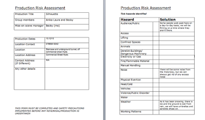
Research and Planning: Risk Assessments


Research and planning: Location recces


Research and planning: Animatic storyboard

Reseach and planning: Film poster draft

This is a draft of my film poster, I have edited the picture by changing the colour variations, and adding more contrast and gamma correction.
I'm not entirely sure that this is the sort of photograph or font I am going to use for the poster, I will have to play around with ideas.

Reesearch and Planning: Update

Our group has begun the filming process. We filmed on the 10th and 12th December around the locations Becky chose. We also took a lot of photographs for our magazines and film posters. We managed to film the chase scenes, the disappearing scenes and shots of our faces to add horror. We still need to film the college scenes of Brendon, which will commence on the 15th December.

Friday, 10 December 2010

Research and Planning: Auditions

As I have had a few absences, I have missed a couple of group meetings meaning i've missed the discussions of dates to start filming and casting. However, in todays meeting I was filled in with the dates of filming, which aren't a problem.
The group held auditions (left) and have decided on which actors to feature in our teaser trailer. The people we have decided to cast in the film are myself and Becky as the main characters, as we both have experience in the drama department, and Anika as one of the characters at the beginning who goes missing, so that she can them help with filming after her characters absence. Meg, Steph and Brendon have also agreed to feature in the teaser trailer to help with star and help with the filming process.

The following photographs are the actors we will be using:


The following people didn't meet the requirements:

Friday, 26 November 2010

Research and Planning: Publication Plan

Research and Planning: Film Magazine Drafts

This is a draft of the film magazine. The white box to the left represents the content of the magazine...and 'text' obviously represents some sort of 'tag line' or 'subtitle'
i will not necessarily be using this photograph, this is just an example of the sort of photograph I will be using.
'Close-up' is the chosen name for my magazine. It works well as it is a shot type, and also could show the intimacy of the interviews and the details of the content.

Research and Planning: Magazine Anaylsis

Empire Magazine (picture left) is a well established film magazine. I like the layout of the components such as the masthead, content and main feature (picture of Harry Potter) I think that the arrangement of the content allows room for the picture to stand out. The colour scheme seems to be red, white, yellow and possibly blue (underneath 'massive preview special.) In my opinion, the white and yellow are fine, but the red differentiates somewhat with the rest of the colours on the page, as the only red on screen in the masthead. However, this use of colour makes the masthead stand out, so you can clearly see the name of the magazine.
I think this particular magazine is aimed at audiences 16+, as there is nothing about the colour scheme or font that would suggest it was for children. Also, words used such as 'bloody' would not suggest a child's magazine as children are considered not to say 'curse words' such as this.


'Jade Screen' (below) is probably less well known than empire, yet I believe the overall appearance in somewhat more professional. The colour scheme is red white and black, which reflects the mood of the main image quite well. The layout of Jade Screen is more simplistic than Empire, as there are no defined columns. The magazine content is squashed into a small box at the very bottom of the cover, separated from the main feature by a border. I do not like this, as it's very hard to see what is actually in the magazine, and at an initial glance, I couldn't see the list of content. I prefer the layout of Empire, as it looks far more structured, and Jade Screen looks more like a film poster than a film magazine. I like the quality of the main photograph, it looks very professional even though it is clearly edited, the vibrancy contrasts greatly to the black background and it's very eye-catching. I also like the font of the masthead, as it's not too simplistic, but not to extravagant.
I would say that the audience for this magazine, is again 16+ as none of the colour schemes or fonts suggest that anything in this magazine is for children.

Sunday, 21 November 2010

Research and Planning: Micro Element

Within the group, each member has specific roles for the production of the teaser trailer. I have been titled as editor. This incorporates the transition of slides, graphics and special effects. This is a key role in the post-production process and how well I manage it can determine the quality and delivery of the final product.

 
Ideas:
I have some basic, rough ideas of how to edit the slides. I will perhaps put a darkened effect on the slides in order to create a darker, scarier atmosphere and to convey horror. The group and I have decided to use freehand cameras while filming to create a first person perspective from the villains point of view. I could play around with effects to find one that works well with the freehand technique, such as slow motion in a particularly dramatic scene.
The program I will be using is iMovie, I have had practice on iMovie (see post titled 'Research and Planning: The Test') and will be creating most effects and joining the slides using this program.

Shared Micro-Element:
The group has decided to share 'sound' as to not give one person two roles. I have some ideas to put forward to my group, such as making our own music in order to avoid copy-write. I could create a simple scary sounding song on the piano, and then perhaps play around with different effects using the program 'Garage Band.' I was also thinking of creating a carnival* song to relate to the villain as he wears a clown mask. This could also be created using garage band.

*carnival music:
http://www.youtube.com/watch?v=gshBY5ZzWpw

Research and Planning: Plan: 22nd - 26th

In order to progress with the production of the teaser trailer, I need to ensure the following occur:

- Decide on specific days and times of shooting that are accesible to every member of the group

- Hold auditions and finalise the cast

- Ensure all props and costumes are collected

Research and Planning: Anaylsis of a Film Poster

Genre:
There are many ways in which this film poster (left) suggests the genre of horror.The expression of fear on the characters face, the dark colours (black, grey, red) and the fire at the bottom all have connotations of 'evil.'

Narrative:
The story this poster displays is a female main character being pulled down by some sinister looking hands to a place that we know from the masthead is hell. This idea is definately a convention of the horror genre, as it reflects a good vs evil vibe. 

Anaylsis:
High-key lighting is used, which differs from the typical low-key horror convention. I think it is used as there is fire used in the imagery, and also to illumiate the characters face so the expression is visable, also to display the hands of the hell minions more clearly. There is much more colour in the main image than the background. which has a black and white/sepia effect. I think this gives a creepier effect as it looks dark and mysterious, another horror convention.  The straight on angle of the photograph suggests to the audience that they are the same as the character i.e they are everyday human beings.  
The layout is fairy simple, as there is a background image, a main image at the front, a masthead, a subheading and the names of the creators. It is probably slightly more complicated than the film poster shown (right) as there is no background image, just the main image. 
The poster (above) is aimed at adults and perhaps people aged fifteen and over, as it shows no signs of violence. It is not appropriate for children, as the picture suggests scenes of a frightening nature, also the title 'Drag me to Hell' suggests the same. 
There could be hints of sexism in the representation of the female character displayed, as it reflects the typical 'damsel in distress' idea associated with gender bias. It also shows the villians as non-human beings, as they are rising out of hell to take the character. 

Research and Planning: Storyboard


This is a rough initial sketch of our storyboard for the teaser trailer, which we will then realise with the aid of the final storyboard.

Research and Planning: Costume Ideas

Costumes:
- Typical student clothes / current fashion for all characters
- Outerwear (for camping scenes)
- Mask (preferably clown)

Monday, 8 November 2010

Research and Planning: Props List


This (above) is a list of all the props needed for our teaser trailer. Included is where we will acquire these props from, and how much roughly, if anything, they will cost.

Research and Planning: Software/Equipment List

There are many pieces of equipment and software that are available to me and our group in order to create our trailer to the best of our ability.

Equipment:
- Digital Camera
- Tripod
- Lighting
- Microphones (if required)

Software:
- iMovie / Final Cut express
- Garage Band
- Photoshop (if required)

Friday, 5 November 2010

Research and Planning: Group Meeting

Today our group got together to discuss ideas and roles within the group. I was allocated the role of editor, as i feel this is my strength. Anika is in charge of cinematography and Becky is in charge of Mise en Scene. We decided to tackle sound as a whole group.

We discussed ideas and came up with a storyline. A group of friends containing a girl and her ex boyfriend go to the woods to camp, the ex boyfriend asks his friend to scare his ex girlfriend and her friends, but the friend takes it too far and starts kidnapping everyone. We, as a group, created a simple storyboard to get together some scenes that could appear within the teaser trailer, and give it some kind of order.

Research and Planning: Cinema Trip


Me and our group went to see 'Despicable Me' at Cineworld in Ashton. The film was rated a 'U' (universal) meaning it is suitable for everybody. There we no acts of violence or offensive language.
The teaser trailers before the film started were very quick, and lasted no longer than 2 minutes maximum, this is what I have to achieve with my own teaser trailer.

Researh and Planning: Treatment

My ideas for the horror teaser trailer all link to some kind of revenge on a character(s). I think a good idea would be perhaps a group of friends going camping in the woods, and they're all having a good time, but then start to go missing one by one. Then one girl at the end gets away but the killer is still around.
Another idea I have is a girl dumping her boyfriend, and publicly humiliating him in front of a lot of people, so then the boy snaps and starts to hunt down the people who humiliated him. I think I'm leaning more towards this idea, as there are many ways in which people can be humiliated, the location could perhaps be a lot easier to get to.
I will have to discuss more with the group.

Research and Planning: Production Schedule

Today the group and I discussed the story for our horror trailer.

We decided that Anika is doing Cinematography, I'm doing Editing, Becky is doing the mise en scen and we are collectively working together for sound.

''The story is two female best friends, coming out of college and bumping into one of the girls ex's, who is still madly obsessively in love with her, but he knew she'd be at the cinema and whilst he was with his best friend, he asked another friend to scare her so she'd see he was the 'Knight in shining Armour' but things didn't go quite to plan and everything goes out of proportion''

Friday, 15 October 2010

Research And Planning: Target Audience

The results of my questonnaire show that I'm targeting mostly people from the age of 16+, socio-economic group D and E, as students fall under this category.
From the questionnaire results I also gathered that students expect to be excited whilst watching a teaser trailer, and be entertained as well as spooked (considering horror trailers) Their interests such as study, fashion, music etc all need to be reflected within the trailer as to catch their attention and make them want to watch the film.

Research And Planning: Questionnaire Results


Above is the questionnaire I created and issued out to 10 people of different ages, the following are the results.

1) 5 were male, 5 were female (this was controlled in order to achieve fair results)

3) The average time for a teaser trailer was approximately 1.15 minutes.
4) The main points put across for this question were the age certificate, some of the story (but not revealing everything) and a conclusion at the end with the film title.
5) 1 voted rom-com, 3 voted horror, 5 voted comedy and 1 voted sci-fi
6) The majority of the participants said no.
7) The general ideas were 'gore' 'suspense' 'flashing images' 'damsel in distress' 'blood' 'victims' and 'villains'
8) Most participants said that horror music should be dramatic, and eerie and spooky.

Research And Planning: Codes and Conventions

 Horror films are designed to cause fear and panic within an audience, sometimes by appealing to our worst nightmares and hidden fears.


I believe that filming with a handheld camera as shown in 'The Blair Witch' trailer (above) would be achievable for me and my group. There are no special effects, and the locations and props are all accessable. This trailer uses typical horror conventions such as low key lighting, close ups to show fright in the characters face, non diegetic atmospheric music and the use of a myth.


'Saw' (above) is an example of a trailer that I would not be able to imitate very successfully. Firstly, there are many locations that are likely to be inaccessable for our group, such as an old deserted bathroom. Also, there is use of weaponry which we would not be able to aqquire. Like 'The Blair Witch,' 'Saw' also uses conventions such as low key lighting and non diegetic atmospheric music. However, there is more suggestion of violence in 'Saw/' and a suggestion of good vs evil.

Research And Planning: Analysis of teaser trailer 1


The beginning of the trailer starts off showing people actually watching the trailer, which targets the audience massively as they can watch the reactions of the on-screen audience and make assumptions about the quality of the film. The audience react by jumping, huddling together and screaming, creating a synergy around the film.
The trailer uses the montage effect, as it shows clips of the film, then reaction shots of the audience, reinforcing the impact of the film. This is particularly noticeable at 1.28, as the non-diegetic music coincides with the flashes of the audience, reinforcing the horror.
The characters in the trailer are all portrayed as 'normal' average people, you can tell this from the costumes they are wearing, which are everyday casual clothes, their accent and dialect portrays an ordinary person also. The woman is portrayed as the 'damsel in distress,' which is perhaps gender bias, yet is also a convention of horror films.
The majority of the slide transitions are straight cuts, yet there is a jump cut (1.25) to represent the fear and horror, and to reinforce the paranormal activities that are happening.
There are many typical conventions in this trailer, for example:
- the dramatic non-diegetic music
- the montage effect
- the low key lighting
- spooky things happening at the night time, pathetic falacy.

Monday, 4 October 2010

Research And Planning: Audience Theories

Hypodermic Syringe Model:
This is the theory that suggests that audiences passively receive data presented by the media.

Cultivation Theory:
This theory examines the long-term effects of television audiences of all ages.

Desensitisation Theory:
This theory suggests that the more we are exposed to something, the less effective it becomes.

Copycat Model:
This theory suggests that there is a relationship between the media and how much it influences the audience in terms of crimes they commit.

Uses and Gratifications Theory:
This theory suggests that audiences have an active role in interpreting and integrating media into their own lives, and can choose media to meet their needs.

Monday, 27 September 2010

Research and Planning: Certificates

For my teaser trailer, I would preferably want either an 15 or 18 certificate.

There are some subtle and some very obvious differences between the two certificates. I am undecided about the certificate as films given an 18 certificate generally make trailers that are 15, so they can be shown more widely in terms of on and off peak times, cinema advertisements etc. I also want it to be either a 15 or 18 certificate as it is a good marketing technique, as people tend to want to see higher rated horror films.

18 Certificates generally include:-
- material in breech of the criminal law
- any detail of violence, illegal drug use.
- explicit images, scenes of sexual activity.

15 certificates generally include:-
- must not include discriminative behaviour or language
- drug taking may be shown, but not promoted.
- weapons and dangerous behaviour, such as self harm, should not be detailed or glamorized.
- frequent use of bad language
- nudity is acceptable in a sexual context but without detail, nudity is acceptable for educational purposes.
- violence may be strong but must not concentrate on the actual pain or infliction. Strong sadistic or sexual acts are prohibited.

Research and Planning: Photoshop Tutorial

This is an initial movie trailer poster I made using Adobe Photoshop. I first captured the zombie background from google images, and also the certificate and company logos (bottom left and right corners.) I used the text tool for the text, and used the paint tool for the red spray on the 'E' of 'Extinction.' I used typical conventions of a trailer poster such as the creators of the film listed at the bottom, and a masthead with a subtitle. I feel to improve the poster I could possibly remove the certificate, as a majority of the movie posters I researched didn't reveal the certificate, eg:


Research and Planning: Pitch


This is the pitch for my project, outlining ideas.